Content Strategy · UX Writing · Meta.com Store
Helping customers compare AI glasses without rebuilding the product page
As Meta's AI glasses portfolio grew, so did a familiar temptation: put everything on one page. Here's how we resisted it — and why that restraint made the whole experience work better.
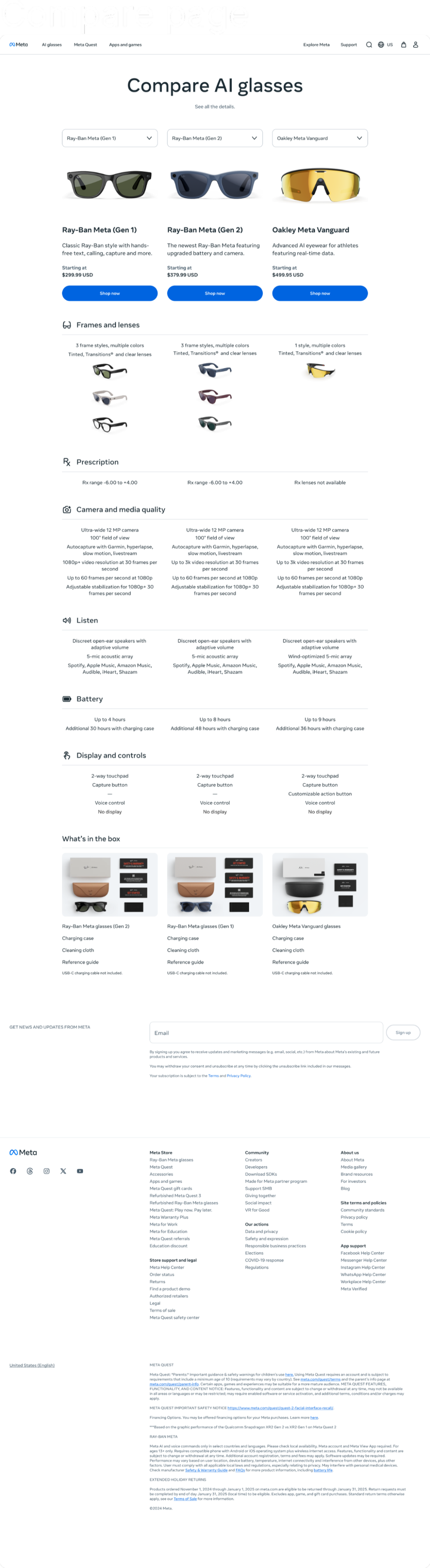
When Meta's AI glasses lineup expanded, customers suddenly had choices they hadn't had to make before. The products could look nearly identical at first glance, but they weren't — one was better for everyday capture, one bumped the camera and battery, one was built for sport, one added a display. Picking the wrong one was a real possibility.
So: The business needed a comparison page. That part was easy. The harder question was what kind.
The temptation was to include everything: every spec, every feature, every value proposition, every marketing message that any stakeholder held dear. But a page that tries to do everything tends to do nothing particularly well. And in this case, it would have just duplicated the product detail pages while making the actual comparison harder to scan.
It was for customers asking "Which one should I buy?"
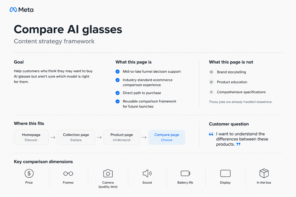
Give every page a job
Before writing a single word, we had to decide what the page was actually responsible for. That sounds obvious. It rarely is.
The answer we kept coming back to: a decision tool for customers who'd already decided they wanted AI glasses and now just needed to figure out which ones. Not a brand story. Not a feature education module. Not a PDP with a different layout.
That definition did a lot of work. It clarified the relationship between the comparison page and everything around it — the collection pages upstream, the product pages downstream. Each had a different job at a different moment in the customer's thinking. Keeping those jobs separate was what made each one useful.
Organize around buying questions, not internal specs
Research and partner inputs pointed to the same short list of questions, over and over: What does it cost? What does it come in? How's the camera? The sound? The battery? Does it have a display? What's in the box?
Those questions became the backbone of the page — not internal feature categories, but buying questions. The kind you'd actually ask a knowledgeable friend.
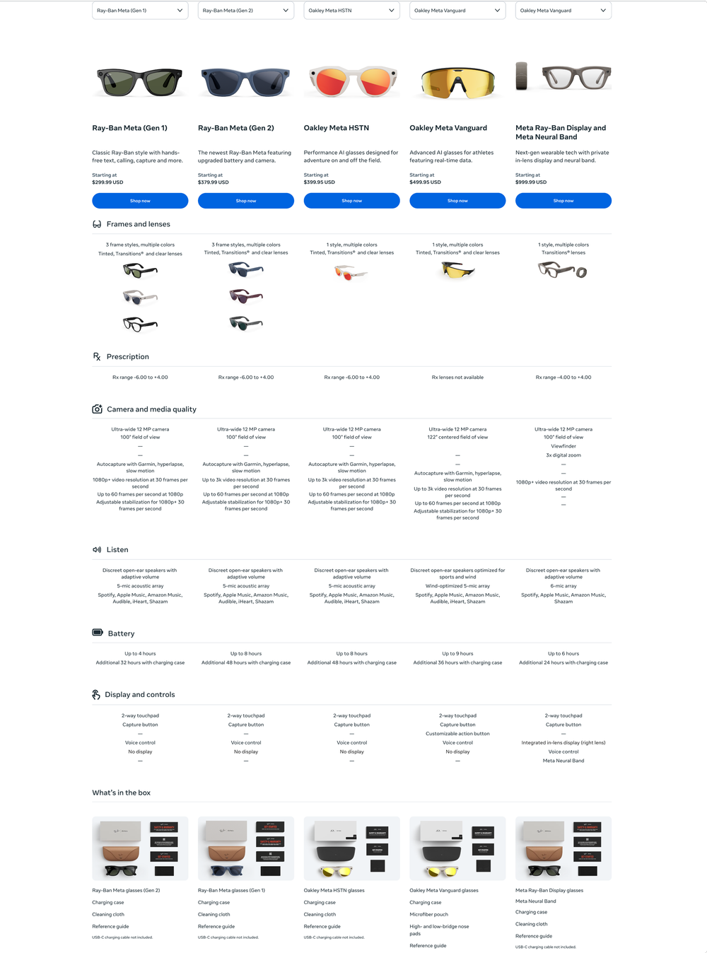
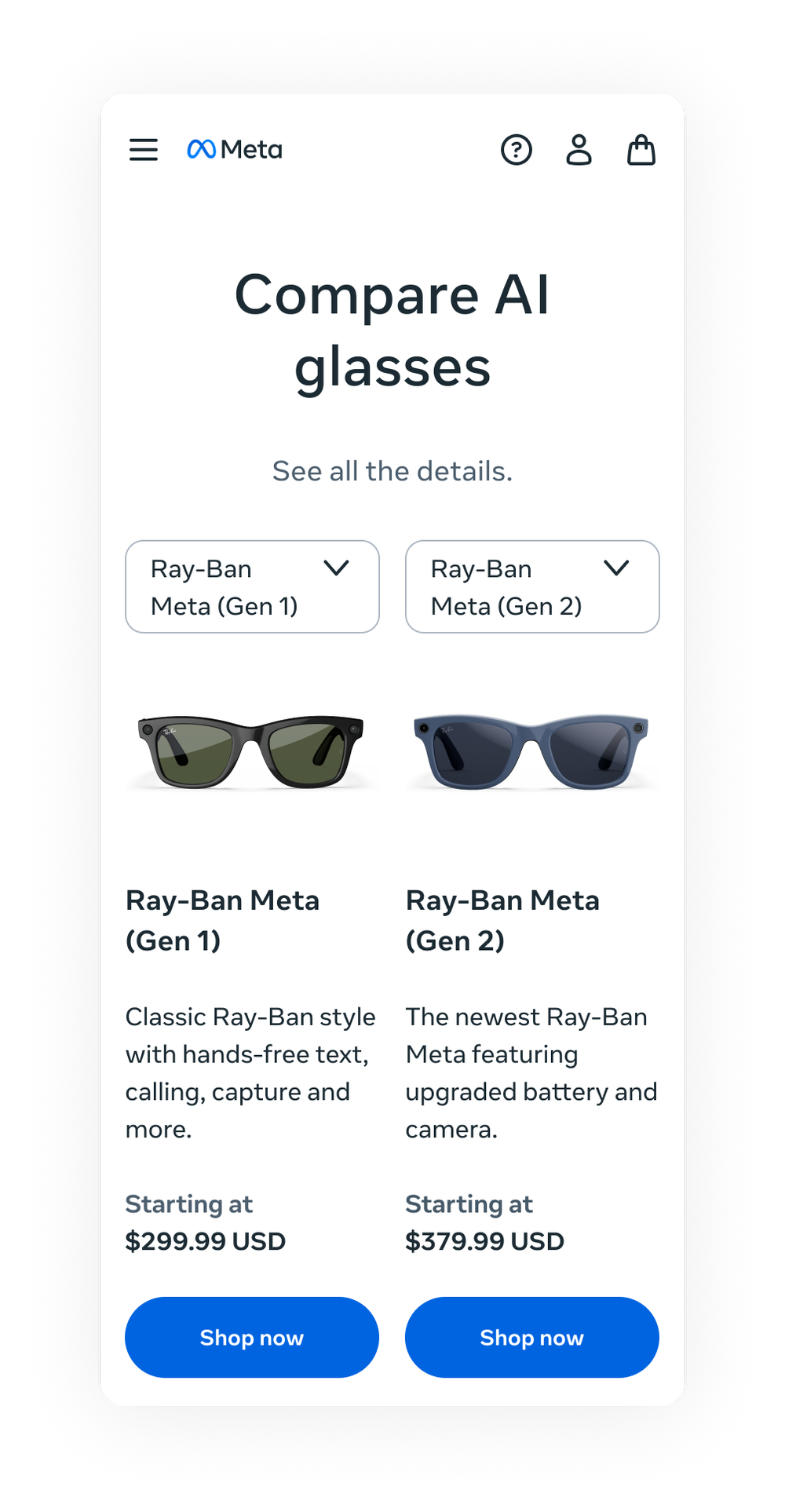
Lead with product cards: image, name, a short positioning line, price and a direct path to purchase.
Group everything else around customer decision categories — frames, prescription, camera, audio, battery, display, box contents.
Keep each row parallel and scannable so customers could move across products without having to relearn the structure as they went.
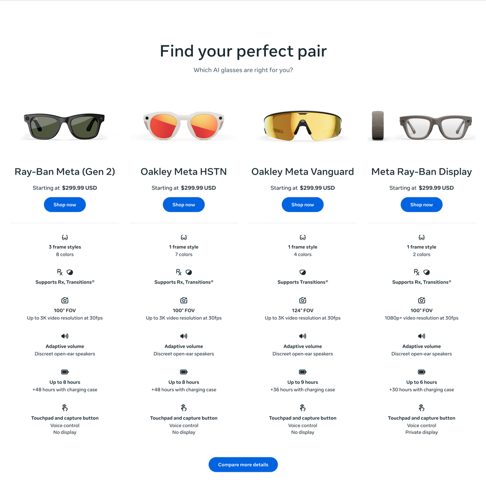
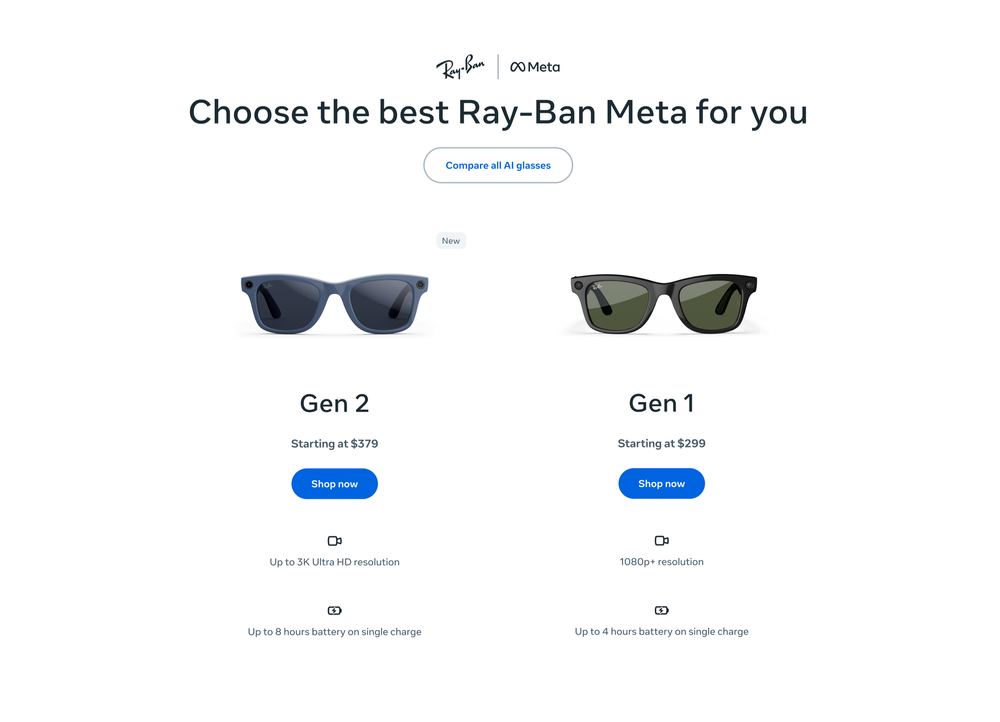
Compare the portfolio first, then the family
One of the more consequential decisions was separating two kinds of comparison that had been getting conflated: portfolio comparison and product-family comparison.
A customer deciding between Ray-Ban Meta and Oakley Meta is in a completely different moment than a customer deciding between Gen 1 and Gen 2. Collapsing both into one page would have served neither well.
The hardest part was deciding what not to include
A comparison page can become a dumping ground fast. Every team has a reasonable request. But reasonable additions can still make a page worse if they pull customers off the task they came to complete.
We drew a firm line: If it helped customers choose, it stayed. If it merely explained, promoted or repeated what already lived on a product page, it went somewhere else — an FAQ, a campaign page, a PDP section.
That line also gave us something useful for stakeholder conversations. Not a judgment call each time, but a principle we could point to.
Desktop and mobile as separate problems
Desktop and mobile required different discipline. On desktop, we could put several products side by side and let customers scan across a full row. Mobile gave us two products at a time, which meant the content had to stay compact and parallel — every row had to work at a glance, not just in context of the full table.
Customers got a cleaner path to a decision. The team got something they hadn't had before: a structure that could absorb new models, new families and new launch moments without being rebuilt each time.
It also settled a question that tends to get reopened every time a portfolio grows: What is a comparison page actually for? In this case, the answer was narrow enough to be useful. One job. Consistently done.
A decision-support framework for a growing AI wearables portfolio — clear enough for customers to use quickly, structured enough to scale without breaking, and principled enough to hold its shape as stakeholder requests piled up.