Content strategy · Meta.com
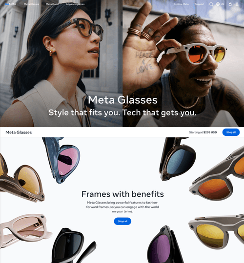
Frames with benefits
A content strategy for the Meta Glasses landing page, and what it taught me about timing.
- Role
- Content design lead, Meta.com Wearables
- Year
- 2025
- Outcome
- Strategy proposed; architecture adopted in 2026
In summer 2025, I proposed a content strategy for the Meta Glasses landing page on Meta.com. Leadership passed. A year later, the live page reflects much of the original thinking. And a headline I'd written, Frames with benefits, landed in a Meta marketing email to millions of subscribers.
The problem
Meta Glasses weren't a product. They were a portfolio.

Ray-Ban Meta. Oakley Meta. The new prescription line. Each frame had its own story, its own audience, its own pitch. What the portfolio lacked was a shared one. A shopper landing on the Meta Glasses page from a search ad or a Meta AI announcement had to do real work to understand what they were looking at. Were these AI devices? Sunglasses? Wearable tech? A fashion play?
The lineup was growing fast and the category was still taking shape. Without a clear story at the top of the page, every individual product had to do double duty: explaining itself, and explaining the category. That cost conversion and clarity at the same time.
The page needed to do something the category itself hadn't done yet: tell shoppers what Meta Glasses are before telling them which ones to buy.
The thinking
Three questions, in shopper order.
I started by writing down the three questions a shopper actually arrives with, in the order they ask them.
- Where am I?
- What are Meta Glasses?
- What can I do with Meta Glasses?
Most landing pages skip the first question. The page chrome (logo, nav, breadcrumbs) is supposed to answer it, and most of the time it does. But Meta Glasses sit in an unusual spot: The nav says "Meta Glasses," but most users still don't know what that means. The H1 needed to do more than label the page. It needed to establish the brand.
The second question is the one most product pages get wrong by trying to answer it with a hero shot and a price. People who don't already know what they're looking at need a sentence, not a glamour shot. The "What are Meta Glasses?" module was where the portfolio story belonged. One line that made the whole thing make sense.
The third question is the easy one. Once shoppers know what these things are, telling them what they can do becomes the fun part.
The page, module by module
One job per module. In shopper order.
Meta Glasses. Standalone. Bold. Brand name first, no cleverness. The page's job here is recognition.
Portfolio-level messaging. Breezy, magazine-inspired. The job of the subhead is to set the emotional register for the page. Not "Shop the latest Meta Glasses." Something with style and a point of view.
Lifestyle imagery. Higher-funnel position calls for higher-funnel imagery. Faces, not specs.
Frames with benefits. This is the value-prop module, the line that makes the category click. Frames anchors the product where shoppers already understand it: as eyewear. With benefits introduces the technology as additive. The technology is the benefit. The frames are the thing.
The module pairs a meatier description with a glamour shot of frames from across the portfolio. The imagery echoes the Shop All grid below, giving the page visual continuity from the value prop down into the product array.
Optional CTA. For shoppers who arrived ready. A quiet escape hatch for users who didn't need the full pitch.
Utilitarian eyebrows, lightweight descriptions. Meta AI, camera, open-ear audio, integrations. The fun stuff.
Visual grid. Bridge from category story to product browsing. Frames, colors and lens options.
What was new
Three moves were doing the real work.
-
Leading with the portfolio, not the product.
Most product pages start with the hero unit and drop you into a grid. This one started with a category story and used the grid as the payoff.
-
Treating the page as a story arc.
Three questions, three modules, in shopper order. Each module had one job. Together they walked the shopper through the category before asking for a click.
-
Positioning technology as the benefit.
This was the bet. Smart glasses had been sold as smart glasses for years. Shoppers had largely shrugged. The category needed to be sold as eyewear first. The technology would follow.
What shipped
The page that shipped isn't the page I proposed.
But the architecture has converged. Module by module:
What I proposed
Hero
Lifestyle imagery. Faces, not specs.
Value prop
Frames with benefits.
Frames first. Technology as additive benefit.
Features
Utilitarian eyebrows with lightweight descriptions of what users can do.
H1
Meta Glasses.
Brand-forward. Recognition over wordplay.
What's live today
Hero
Extreme close-up of a face wearing the product.
Value prop
The incredible power of AI glasses, now in stylish frames crafted to fit like they were made just for you.
Frames first. Technology as the additive benefit.
Features
Extraordinary glasses for ordinary life.
Feature-led section below.
H1
Look. Incredible.
Different direction: wordplay over brand recognition.
I don't know who made the decisions, or how they got there. But the bet underneath the live page is the same one I'd proposed: This category had to be sold as eyewear with technology as the benefit.

And in June 2026
Frames with benefits
landed verbatim in a Meta marketing email to millions of subscribers.

What this reveals
Content strategy works hardest when the product is still figuring out what it is.
The job is to listen for what the product is actually doing, and find the story that makes it cohere.
The frame I keep returning to is the three questions: Where am I? What is this? What can I do with it? They're not specific to e-commerce. They're how any new user approaches anything unfamiliar. If a page can answer those three questions in order, with care, the rest of the work is execution.
Foresight, in this kind of work, comes from one thing: taking the user's questions seriously before the org is ready to.